The frills and furbelows of the short-lived New Romantic Movement having been consigned to the back pages of fashion history, a maverick collective made up of photographers, designers and artists, under the loose direction of stylist Ray Petri, quietly defined a particular look of 80's urban youth culture, the legacy of which continues to influence contemporary trends in fashion and photography to this day. Many have defined the eighties as the decade in which style dominated substance, but Petri's work under the 'Buffalo' collective was, in many senses, the antithesis of the 'matt-black designer decade with which we have come to view the decade that was to follow after the punk explosion of the seventies had irrevocably re-written the rules of style and politics. Post-punk, style magazines such as The Face, I-D and Arena began to posit Petri's work as a pointer for all that was to follow, and the blueprint for an uncompromisingly urban style that has since inspired a generation of designers, stylists and photographers who saw themselves as outside the 'normal' confines of the industry. Buffalo seemed the logical product of the do-it-yourself post-punk generation, and the antithesis of that self-serving careerism that defined much of the eighties in Britain and the United States. Initially difficult to interpret by the mainstream, the Buffalo aesthetic was first and foremost, concerned with a certain kind of hip, urban attitude that rapidly filtered into the mainstream.
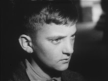
Petri's vision for Buffalo can now be viewed as prophetic, shadowing as it did, contemporary fashion's 'post-gender' identity, and laid the ground for the merging of sportswear with high fashion, a trend that is now seen as universal. Construed as a multi-faceted 'state of mind', Buffalo pulled together influences from a number of seemingly random sources, melding pin-sharp, layered tailoring with the famous MA-1 flying jacket (an essential element of skinhead attire), vintage Levis and lace. Headgear was everything from bowlers to Native American war-bonnets. Nothing, it seemed, was off-limits. Hugely influential, and undoubtedly the style-bible for the decade, The Face defined the way we wore and heard during the heady years of its duration. Editor Nick Logan consciously steered the content of the magazine in increasingly more diverse directions, and spearheaded the still-undefined Buffalo style in many of its issues. The groundbreaking cover that featured a male model bare-chested under a military jacket and sporting a kilt with a Union Jack slung over one shoulder was to influence the likes of a generation that included Alexander McQueen and Jean Paul Gaultier, and it is more than probable that the mainstream would never have witnessed the likes of David Beckham in a skirt without Buffalo's legacy in the 1990s. Jamie Morgan, undoubtedly the most significant photographer of the Buffalo movement, was responsible for one of the most iconic covers of the magazine's history, the 'Hard' issue that featured Felix, then a 13 year-old east end boy in a formal chalk-strip jacket, knuckle-duster gloves and a feathered homberg with the legend 'Killer' cut from a 'Red-top' headline. The image was groundbreaking, and was followed by other, equally iconic covers. The 'Hot' issue saw model Nick Kaymen (forever identified with the Buffalo collective, as well as the famous Levi's ad campaign) in a skiing hat with aviator shades and whitened lips, an orange elastoplast fixed across one eyebrow.
Writing in 2007, designer Kim Jones stated; 'Ray Petri is an inspiration for most people in menswear. He worked with a loyal group of people to create a new aesthetic, and his references were so on-target that they are still relevant today. This is extremely rare in fashion, where everything seems to move so quickly'.
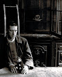
Petrie (he later dropped the 'e') was born in Scotland in 1948. At the age of 15, his family moved to Brisbane where he formed a band called 'The Chelsea Set', playing R&B classics and Motown covers. Sensing that his life in Australia was becoming too provincial, he came to London in 1969 and launched himself into the emerging gay club culture, and undertook classes at Sotheby's in order to learn about the antique market. By the early eighties, British club and fashion culture has become a rag-bag of post-punk style, where sartorial fragments of the past had converged and taken to the streets. Petri somehow found his calling as a sort of fashion arbiter, and as an overseer, began to develop an innate sense of what was required to create an image that would last in the ever-changing universe of the fashion genre. Rather than relying on agency models and gym-buffed blonds, he cast mixed-race teenagers and dressed them in designer clothes that he paired with underwear, sportswear and vintage pieces, and the effect was uncompromisingly tough and sexually charged. Recalling Ray Petri, photographer Jean-Baptist Mondino says: 'Ray created an entire personal world' and 'was obsessed with 'bad boys, Jamaican culture and Native American imagery, and was always surrounded by a crowd of beautiful people. [Buffalo] was a true collective - in a way it reminded me of the Surrealist movement, but everyone was cool and relaxed...'
Mondino, who over the years collaborated with Petri on videos and editorial spreads, sees him more as a designer than a stylist. 'He reshaped clothes to create silhouettes that simply did not exist at the time. He loved the idea of classic Italian tailoring done in a Caribbean way. From the front, the boys appeared effortlessly dressed, but in the back they were completely pinned, tucked and taped. Ray was obsessed with extra-long shirt sleeves, so he would cut them off at the shoulder and re-attach them with big safety pins so they stuck out under suit jackets...'
Much of the Buffalo look was defined by the juxtaposing of differing sartorial elements; boxer shorts and army boots worn under a trench coat or Lonsdale genital protectors worn with lace tops and knitted bobble-hats. He took the name for the emerging group of photographers and stylists from Jacques Negrit, a bouncer at the Les Bains Douches nightclub in Paris, The management employed a private security firm staffed by imposing men from Guadeloupe who wore the famous airforce MA-1 jackets with 'Buffalo' emblazoned on the backs. It was claimed also to be a reference to 'Buffalo Soldier', Bob Marley's famous song about black infantrymen who fought in the U.S. Army against native American tribesmen. Petri's posse wore the cobalt-blue version of the jacket, which became a sartorial byword for the Buffalo style. Singer Neneh Cherry was to cement the movement with her 1988 hit 'Buffalo Stance', which spread the word about the style throughout the world. Cherry met Petri en route to Tokyo, where he was producing a show using London teenagers as models. Says Cherry; 'None of us were into here-today-gone-tomorrow fashion, which is why we gravitated to one another. Ray was always consistent, and he taught us that we shouldn't be afraid to be honest'.
Poised to receive the mainstream recognition and financial success that many in his slipstream enjoyed, Petri became infected with the AIDS virus. 'He was one of the first well-known personalities in London to get the disease, and at the time, not everyone knew how to react' stated milliner Stephen Jones at the time. 'Sometimes, people would move away from him at fashion shows, or they wouldn't invite him at all'. A notable exception was the designer Jean Paul Gaultier (for whom Petri was a huge influence), who held a front-row seat for Petri until his death in 1989. 'Ray died just as fashion was becoming more commercial' concludes Jean Baptiste Mondino. '...but I don't think that he would have approached things any differently than he always did. Most of his friends have made some money over the years, but to tell you the truth, we get a little bored a lot of the time...'
Buffalo photographer Jamie Morgan, writing after Petri's death, opined that 'Ray, being gay, wanted to show that a man can be sexy, well-groomed, beautiful; all the things that are now associated with gay men. He made it okay for heterosexuals to own that, whereas only women had before. Buffalo is very, very inclusive for all men, and you see it now when someone like David Beckham wears a sarong. He would never have worn that sarong if Buffalo hadn't put a man in one...'